Here’s an uncomfortable question: did you choose your app’s primary color because it matches your logo, or because you actually tested how it affects user behavior? Most businesses do the former. That gap is exactly what color psychology UI design Hyderabad teams get called in to fix, usually after a client notices conversion isn’t where it should be.
We’re not talking about vague “red means passion” advice here. Let’s get into what color choices genuinely do to user behavior in an interface.
Color Isn’t Decoration — It’s Instruction
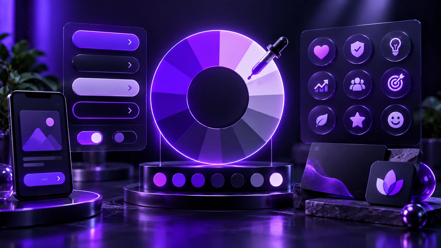
Every color in your interface tells the user something before they read a single word. A grayed-out button says “not available right now.” A bright, saturated button says “click me.” Users process this instantly, often before consciously registering what the button even says.
So the real question isn’t “what color do I like” — it’s “what am I telling users with this choice, intentionally or not.”
What Different Colors Actually Signal in Digital Interfaces
Blue dominates fintech and B2B software for a reason — it reads as trustworthy and calm, which matters enormously when you’re asking someone to hand over money or sensitive data.
Green signals “go” and “success” almost universally in digital contexts, which is why it’s the default for confirmations and positive actions across most design systems.
Red carries urgency and warning, useful for errors or limited-time offers, but overused, it creates anxiety that actually suppresses action instead of driving it.
Orange and yellow feel energetic and approachable, common in CTAs for consumer apps wanting to feel less corporate and more accessible.
The Contrast Problem Nobody Talks About
Beautiful color palettes often fail on one critical metric: contrast. A gorgeous pastel button might photograph well for a portfolio, but if users with any visual impairment — or just bright sunlight on their phone screen — can’t read it clearly, you’re losing conversions silently.
Check every meaningful color pairing against WebAIM’s contrast checker before finalizing a palette. This single step catches problems that pure aesthetic judgment consistently misses.
Why Your Competitor’s Blue Button Isn’t a Coincidence
Category conventions exist because they work. Payment confirmation buttons across most apps land somewhere in blue or green because users have learned to associate those colors with safe, forward-moving actions in financial contexts.
Breaking convention can differentiate your brand, but breaking it accidentally — using red for a “confirm purchase” button, for instance — creates friction users can’t quite articulate but definitely feel.
Testing Beats Assuming, Every Time
Internal debates about “the right color” waste time that A/B testing resolves definitively. Run your top two or three color candidates against real users and real conversion data using tools like Optimizely, rather than settling arguments based on whoever’s most senior in the room.
This is the difference between designing on opinion and designing on evidence.
Cultural Context Matters More Than You’d Think
Color associations aren’t universal. What reads as celebratory in one cultural context can read as somber in another. For apps serving diverse Indian audiences across regions and demographics, testing color reception with your actual target users matters more than applying Western color psychology research uncritically.
Building a Functional Color System, Not Just a Pretty Palette
Your interface needs distinct colors for primary actions, secondary actions, errors, warnings, and success states — each consistently applied so users build reliable mental associations over time. A design system approach, documenting exactly when each color gets used, prevents the drift that happens when different team members make inconsistent color choices project to project.
How NRS Technologies Approaches Color in Interface Design
We choose color systems based on the specific actions we need users to take, then validate those choices against real contrast standards and, where possible, actual user testing. Our UI/UX design services build this functional approach into every project.
As a result, clients get interfaces where color actively guides users toward conversion, not just palettes that photograph nicely. Our mobile app development and website design work both apply this same evidence-based approach to color.
Frequently Asked Questions
Does the color of a call-to-action button really affect conversion rates? Yes, meaningfully. Color affects how quickly users notice and trust a button, though the specific best color depends on context, contrast, and what action you’re prompting.
Is red always a bad color for buttons? No, red works well for urgent or limited-time actions, but overusing it across an interface can create anxiety that suppresses rather than encourages action.
How do I know if my color choices have enough contrast? Use a contrast checking tool like WebAIM’s to verify text and interactive elements meet accessibility standards, rather than judging contrast by eye alone.
Should I follow color conventions or try to stand out with unusual choices? Following conventions for critical actions like payment confirmation reduces user friction, while reserving distinctive color choices for brand personality elsewhere in the interface.
Do color psychology principles apply the same way across different cultures? Not entirely. Color associations vary by cultural context, so testing with your actual target audience matters more than applying general color psychology research universally.
How can I test which color actually performs best for my app? A/B testing your top color candidates against real conversion data provides definitive answers that internal opinion-based debates simply can’t.
Bottom Line
Color choices in your interface are functional decisions, not aesthetic ones. Get the psychology and contrast right, and your interface starts guiding users toward the actions that actually grow your business.
Want your interface’s colors working for conversion, not just looking nice? Talk to NRS Technologies at hello@nrstechnologies.com or visit nrstechnologies.com/contact.