
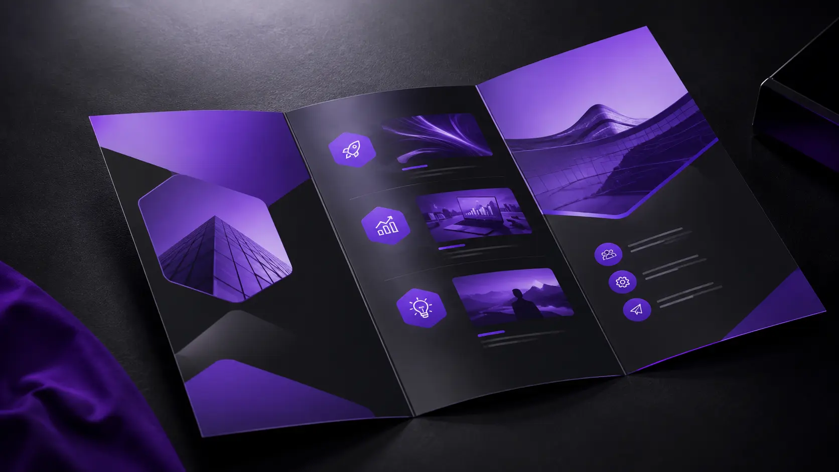
Most brochures get glanced at once and thrown away. That’s not a print quality problem — it’s a design problem, and it’s exactly what a brochure design company in Hyderabad should fix before the first draft.
We’ve designed brochures across industries at NRS Technologies. Here’s what separates the ones people actually keep from the ones that end up in the bin.
Why Most Brochures Fail
Cramming every service, feature, and credential onto one page overwhelms readers instantly. They skim, understand nothing clearly, and set it aside.
So the goal isn’t fitting more in — it’s saying less, more clearly. Restraint is what makes a brochure actually get read.
Start With One Clear Message
Every brochure needs a single core message driving the whole design. Not five messages competing for attention — one, supported by everything else on the page.
This forces hard editing decisions. But it’s exactly what makes the final piece memorable instead of forgettable.
Visual Hierarchy That Guides the Eye
Readers should know exactly where to look first, second, and third. Size, color, and placement all guide this — not left to chance or guesswork.
Your headline should be unmistakable. Supporting details come next, in a clear, deliberate order.
Typography Choices That Matter
Two typefaces maximum, generally. One for headlines, one for body text, chosen for both personality and pure readability.
Generous line spacing improves comprehension significantly. Cramped text feels like work to read, and most people simply won’t bother.
Color Strategy for Brand Recognition
Your brochure should be instantly recognizable as your brand, even without a logo visible. Consistent color use across all your materials builds that recognition over time.
High contrast between text and background isn’t optional — it’s what makes the content readable at all, especially in print.
Fold Formats and Layout Considerations
Tri-fold remains a versatile standard, giving you six clear panels to structure information logically. Bi-fold works well for simpler messages needing less real estate.
Whatever format you choose, plan the actual folding sequence during design, not after. Content that reads out of order confuses readers immediately.
Print Quality and Paper Stock
Paper stock affects perceived quality more than most businesses realize. A premium, heavier stock signals a premium brand, even before anyone reads a word.
This matters especially for high-value services where trust and credibility need to come through in every touchpoint, print included.
How NRS Technologies Designs Brochures That Get Read
We start every brochure project with a single core message, then build the visual hierarchy and layout around communicating it clearly. Our graphic design services cover brochures alongside broader brand identity work.
As a result, clients get materials people actually engage with, not just print and forget. Our website design services also ensure your printed and digital materials stay visually consistent.
Frequently Asked Questions
What’s the biggest mistake businesses make with brochure design? Trying to include too much information at once, which overwhelms readers and dilutes the core message instead of communicating it clearly.
How many fonts should a brochure use? Generally two at most, one for headlines and one for body text, chosen for both personality and readability.
Is tri-fold or bi-fold better for a brochure? It depends on your content volume. Tri-fold offers more structured panels for detailed information, while bi-fold suits simpler, more focused messages.
Does paper quality really matter for brochure design? Yes, paper stock significantly affects perceived brand quality, especially for high-value services where trust needs to come through in every touchpoint.
Should a brochure include every service my business offers? No, focusing on your core offering or message with clarity typically performs better than cramming in every possible service.
How does brochure design relate to overall brand identity? A brochure should reflect your established brand identity, using consistent colors, typography, and messaging so it feels connected to your other marketing materials.
Final Thoughts
A brochure earns its place on someone’s desk by being genuinely clear, not by including everything. Restraint and a single core message consistently outperform information overload.
Ready to get started? Contact NRS Technologies at hello@nrstechnologies.com or visit nrstechnologies.com/contact for a free brochure design consultation.