
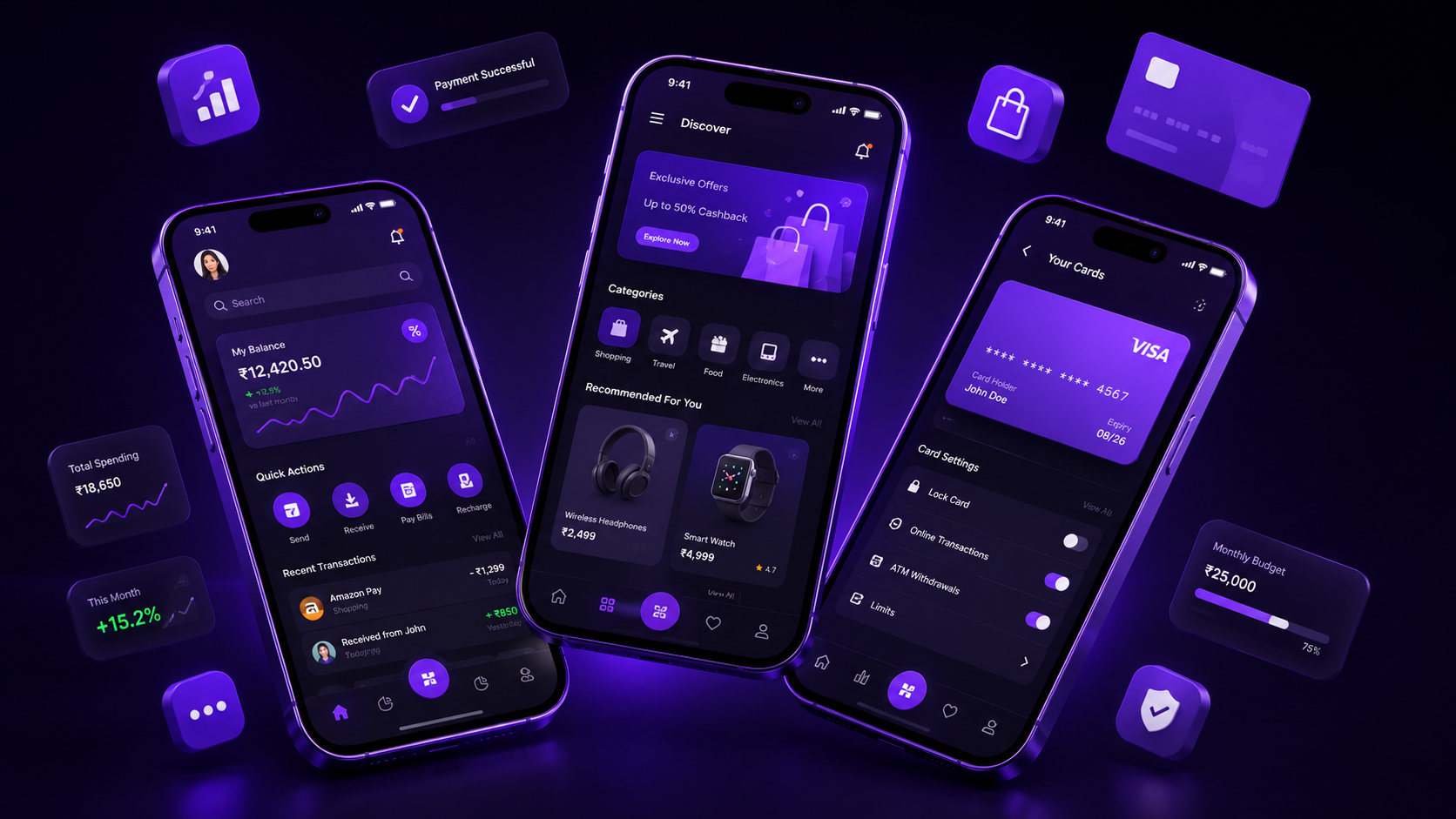
If your website was designed on a desktop monitor first and “adapted” for mobile as an afterthought, it’s likely losing the majority of your visitors before they ever see your offer. As a mobile UX design company in Hyderabad, this is the single most common structural mistake we see in redesign requests.
Mobile Internet Usage in India
Mobile devices account for the majority of web traffic globally, and India’s numbers skew even higher given widespread mobile-first internet adoption. Statista’s mobile traffic data confirms this trend has only strengthened year over year — making mobile experience the primary experience for most businesses, not a secondary one.
What Mobile-First Design Actually Means
Mobile-first isn’t the same as “responsive.” Responsive design often starts with a desktop layout and shrinks it down, which frequently results in cramped navigation, tiny tap targets, and content prioritization that doesn’t match how mobile users actually behave. True mobile-first design starts with the smallest screen, forcing ruthless prioritization of what actually matters, then expands up to larger screens.
Touch Targets, Font Sizes, and Gesture Navigation
Small, closely-packed buttons are one of the fastest ways to frustrate mobile users. Following minimum touch target sizing guidance from Apple’s Human Interface Guidelines and readable font-size baselines dramatically reduces mis-taps and abandoned interactions.
Mobile-Specific UX Patterns
- Bottom navigation bars — keep primary actions within thumb reach
- Swipeable cards — natural, familiar interaction for browsing content or products
- Sticky CTAs — persistent “Add to Cart” or “Book Now” buttons that follow scroll
- Simplified forms — fewer fields, native input types, autofill support
These patterns are consistently reinforced across Material Design’s responsive layout guidance and ongoing coverage on UX Planet.
How to Test Your Mobile UX
Don’t rely on assumptions — test on real devices and emulators:
- BrowserStack — test across real device/browser combinations
- Chrome DevTools’ Device Mode — quick responsive checks during development
- Figma mobile preview — validate designs on an actual phone before development begins
Research from the Nielsen Norman Group on mobile UX remains one of the most reliable ongoing sources for evolving mobile usability standards.
Real-World Impact: Conversion After Mobile Redesign
Businesses that move from a desktop-first, “shrunk-down” experience to a true mobile-first redesign commonly see meaningful jumps in mobile conversion rate — often driven simply by reduced friction: fewer taps to checkout, larger touch targets, and clearer above-the-fold messaging on small screens.
How NRS Technologies Approaches Mobile-First Design
Every project starts with mobile wireframes first, not desktop mockups scaled down. We test on real devices before development, not just in browser emulators, to catch real-world friction points early.
Frequently Asked Questions
Is mobile-first design the same as responsive design? No, responsive design adapts a layout across screen sizes, but mobile-first specifically means designing for the smallest screen first, then scaling up, which produces different prioritization decisions.
What’s the minimum recommended touch target size? Most platform guidelines recommend touch targets of at least 44×44 pixels to reliably reduce mis-taps on mobile devices.
Do mobile-first sites perform better in Google rankings? Yes, since Google uses mobile-first indexing, meaning the mobile version of your site is the primary version used for ranking evaluation.
How can I tell if my current site has mobile UX problems? High mobile bounce rates, low mobile conversion compared to desktop, and user complaints about difficult navigation are all common indicators worth investigating.
Final Thoughts
Mobile is not a secondary experience anymore — for most businesses, it’s the primary one. Designing mobile-first isn’t optional polish; it’s the baseline expectation of anyone landing on your site in 2025.
Ready to get started? Contact NRS Technologies at hello@nrstechnologies.com or visit nrstechnologies.com/contact for a free mobile UX audit.
Is your mobile experience costing you customers? Talk to NRS Technologies about a free mobile UX audit. 📧 hello@nrstechnologies.com | 🌐 nrstechnologies.com/contact