
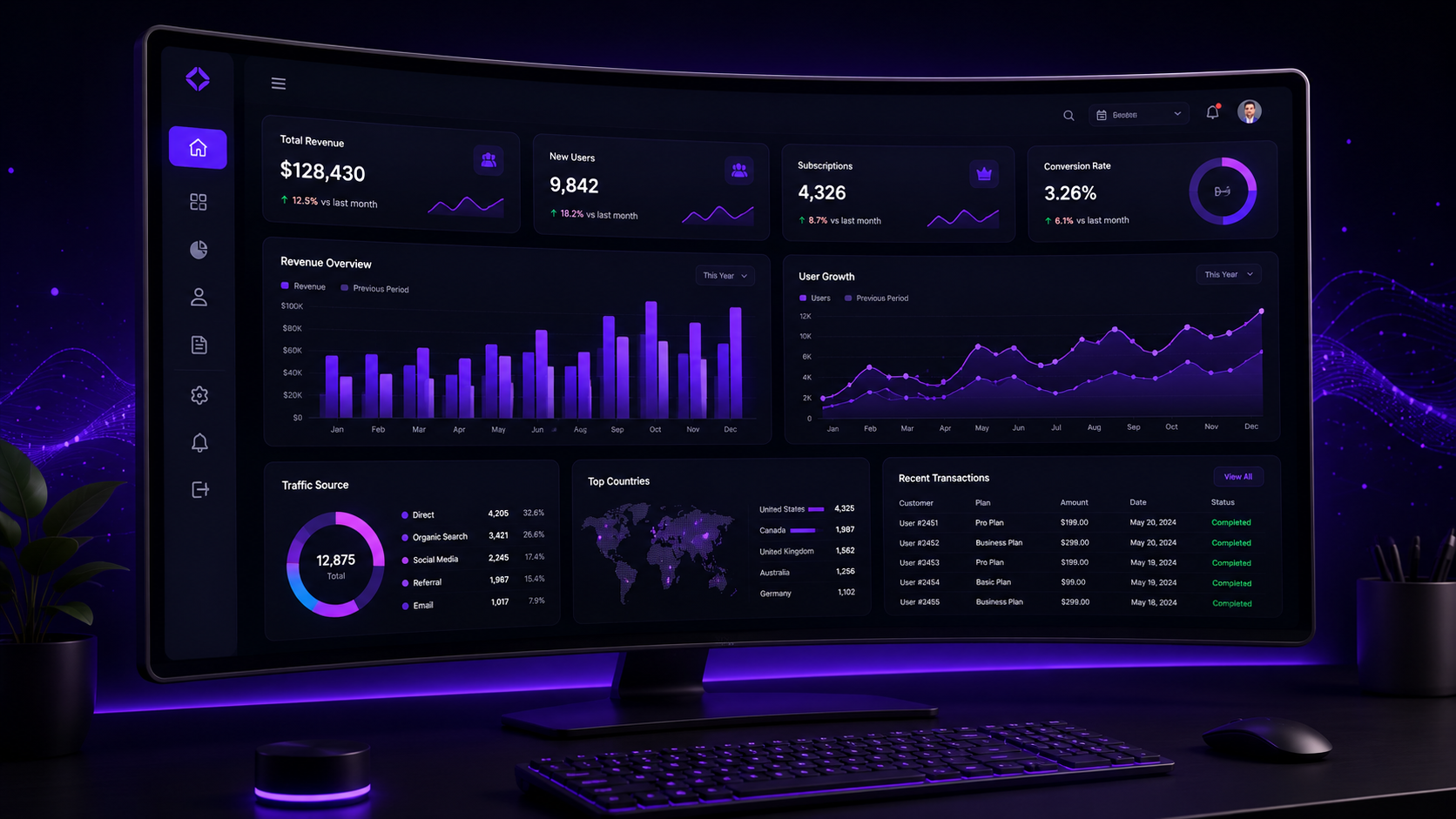
A confusing dashboard doesn’t just frustrate users — it directly drives churn. As a SaaS dashboard UI/UX design company in Hyderabad working with early-stage and growing SaaS products, we’ve seen well-built features go unused simply because the dashboard buried them under poor information hierarchy.
What Makes SaaS Dashboards a Unique UX Challenge
Unlike marketing sites, dashboards are used repeatedly, often daily, by the same users who need to accomplish specific tasks quickly. This shifts design priorities entirely — clarity and speed of task completion matter far more than first-impression visual impact, since users aren’t “discovering” the product each time, they’re returning to get work done.
Data Visualization Principles
Choosing the right chart type matters more than making charts visually impressive. Line charts for trends over time, bar charts for comparisons, and simple KPI cards for single critical metrics each communicate differently — mismatching chart type to data type is one of the most common dashboard design mistakes. Libraries like Recharts and D3.js offer the technical flexibility to implement these correctly once the right visualization is chosen.
Information Hierarchy and Progressive Disclosure
The most important metrics belong above the fold, with secondary details available on click or hover rather than cluttering the primary view. Progressive disclosure — revealing complexity only when a user actively seeks it — keeps dashboards feeling manageable even as feature sets grow over time.
Dark Mode vs Light Mode for Dashboards
Dark mode has become a near-standard expectation for data-heavy SaaS dashboards, partly due to reduced eye strain during extended use and partly due to how well data visualizations pop against darker backgrounds. Offering both, rather than forcing one, is increasingly the expected baseline rather than a premium feature.
Responsive Dashboard Design for Mobile
Not every dashboard needs full desktop-parity mobile functionality, but critical actions and key metrics should remain accessible on mobile for users checking in on the go. Reference layout patterns from Material Design and enterprise-grade component libraries like Ant Design both provide solid, tested patterns for scaling complex interfaces down to smaller screens without losing usability.
Onboarding UX Within Dashboards
First-time dashboard experiences need guided onboarding — tooltips, progressive feature reveals, or a brief guided tour — since an empty or unfamiliar dashboard on day one is one of the fastest paths to early churn. This onboarding investment consistently pays off in activation rate more than almost any other single UX improvement in SaaS products.
Design System Approach for SaaS
Building a component-based design system in Figma — reusable buttons, cards, form elements, chart components — ensures consistency as the product scales and dramatically speeds up future feature development. Tailwind UI and Figma’s own community resources offer strong reference component libraries worth reviewing before building custom systems from scratch.
How NRS Technologies Approaches SaaS Dashboard Design
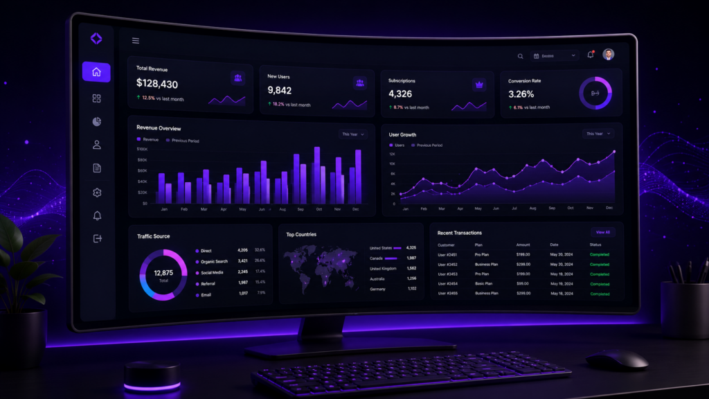
We start every dashboard project by mapping the specific tasks users need to accomplish most frequently, then design information hierarchy around those tasks — not around every possible feature the product offers. This task-first approach consistently produces dashboards that feel simpler even as underlying functionality grows in complexity, drawing on established UX research patterns from UX Design’s SaaS-focused publications.
Frequently Asked Questions
Should every SaaS dashboard support dark mode? It’s increasingly expected for data-heavy dashboards, given reduced eye strain during extended use and improved visual contrast for charts, though offering both light and dark options is ideal.
How much data should be visible on a dashboard’s main screen? Only the most critical, frequently-checked metrics; secondary details should be accessible through progressive disclosure rather than displayed all at once.
Is onboarding really necessary for a SaaS dashboard? Yes, guided onboarding for first-time users significantly improves activation rates and reduces early churn compared to leaving new users to explore an unfamiliar interface alone.
What’s the biggest mistake in SaaS dashboard design? Prioritizing every possible feature equally rather than establishing clear information hierarchy around the tasks users actually perform most frequently.
Should dashboards be fully functional on mobile? Not necessarily fully functional, but critical actions and key metrics should remain accessible for users checking in on the go.
How often should a SaaS dashboard’s design be revisited? Ongoing incremental refinement based on usage analytics is ideal, with a more significant design system review roughly every 12-18 months as the product matures.
Final Thoughts
Great SaaS dashboard design isn’t about impressing users on first login — it’s about making the tasks they perform every single day faster and less frustrating over time.
Ready to get started? Contact NRS Technologies at hello@nrstechnologies.com or visit nrstechnologies.com/contact for a free dashboard UX audit.